Python Flask & Chart JS - Livestream Data from SQLite
This post is an example of how to present a live stream of Timeseries data from an SQLite database hosted on Flask and using Chart JS. There are a number of Python charting modules (like Bokeh) but by using Javascript, it takes some of the strain away from the server and onto the client (unless Flask isnt being externally hosted). The example im about to show you uses ChartJS which is an open source Javascript HTML5 chart generator. There are some great alternatives out there like Highcharts but ChartJS has the huge advantage of being open source.
Flask applications typically use SQLite but they dont have too. SQLite is a single file database so its lightweight (although it dosent have to be small). They are prefered to single file storage as you can query an SQLlite database for fast results and they are also more compact in size.
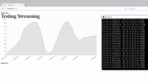
(apologies, the GIF isnt great)
Here is the full code, read the below to get a breakdown of what is going on and how to run it properly.
Files
The files might look a bit intimidating at first unless you are familiar with Flask. I have broken the files up to keep it nice and simple.
create_database.py
This file does exactly what it says - it creates the SQLite database. This file should be used once and then pretty much left alone. What it does is it creates the database schema using SQLAlchemy through a method called Object Relational Mapping. This basically means that we can define a Python Object (class) and SQLAlchemy will do the magic to create the database scheme. This defined the tables, any relationships and what type and size the fields are.
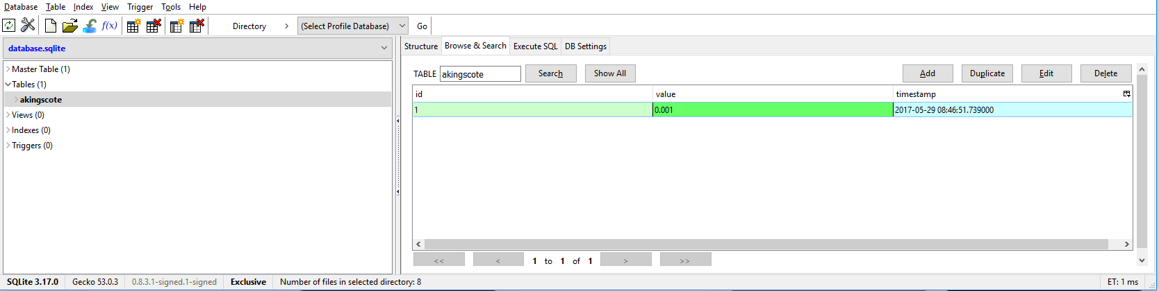
The script also goes and adds in a random entry although thats not really needed. Its useful just for debugging. What I like to do, is use the Firefox Extension SQLite Manager and have a look at the database to make sure its all good.
1
2
3
4
5
6
7
8
9
10
11
12
13
14
15
16
17
18
19
20
21
22
23
24
25
26
27
28
29
30
31
32
33
34
35
36
import os

from sqlalchemy import Integer, String, Float, DateTime
from flask import Flask
from flask_sqlalchemy import SQLAlchemy

from time import sleep
import datetime
HOST = 'localhost'
PORT = 5000

# os independant way of declaring the database
DATABASE_NAME = 'database'
SQLALCHEMY_DATABASE_URI = 'sqlite:///{}.sqlite'.format(DATABASE_NAME)
database = os.path.join(os.path.dirname(__file__), SQLALCHEMY_DATABASE_URI)

app = Flask(__name__)
app.config.from_object(__name__)

db = SQLAlchemy(app)

class akingscote(db.Model):
id = db.Column(db.Integer, primary_key=True)
value = db.Column(db.Float(20))
timestamp = db.Column(db.DateTime)

# Reset all the database tables
db.create_all()

if __name__ == '__main__':
print 'adding some default data'
time = datetime.datetime.utcnow()
data = akingscote(timestamp=time, value=0.001)
db.session.add(data)
db.session.commit()
print 'finished'
feed_data.py
Once the database has been created, you can run the feed_data.py script separately. This will feed a random integer value into the value field and the current datetime into the timestamp field every second. This is simulating some timeseries data.
I use the SQLAlchemy engine mechanism to feed data into SQLite as it is blazingly fast and is also really simple to use. You can easily build up query string in python, then pass it to the execute function.
1
2
3
4
5
6
7
8
9
10
11
12
13
14
15
16
17
18
19
20
21
import datetime
import random
from flask import Flask
from sqlalchemy import create_engine
from time import sleep

engine = create_engine('sqlite:///database.sqlite')
con = engine.connect()
while True:
    try:
        time=datetime.datetime.utcnow()
        data = random.uniform(0,100)
        con.execute("INSERT INTO akingscote (value, timestamp) VALUES ({}, '{}')".format(data, time))
        print 'Inserted {}, {}'.format(data, time)
        sleep(1)


    except KeyboardInterrupt:
        con.close()

con.close()
Here I am creating an engine object from the create_engine class and then connecting to my sqlite database. Then ive put a continuous loop in (not the best) to add data. A timestamp is taken using the datetime.utcnow() function, and a random integer between 0 and 100 is inserted. Then the code sleeps for a second before repeating. This means that the timeseries data will be at one second interface. This is just a little script to simulate some timeseries data.
The rest of the files
Im not going to explain how flask works or its architecture. Basically, HTML code goes into the Templates directory and Javascript and CSS goes into the Static directory (it dosent have to be like that, its just how their documentation has it). Ive actually created the javascript inline on the home_page.html file just for clarity.
By running the application.py this will start up the Flask server and allow you to view the home page file. This can be accessed through the web browser at the Flask default address of localhost:5000.
The application.py file is fantastically simple. It connects to the SQLite database using the engine (really fast, thread-local mechanism). There are home_page route is used to load the home page where the chart will be rendered, the other is called in a HTTP GET request to fetch data. The latest timeseries result is returned in the result.
from flask import Flask, jsonify, request, render_template, redirect, url_for from sqlalchemy import create_engine
app = Flask(name) engine = create_engine(‘sqlite:///database.sqlite’)
@app.route(‘/’) def home_page(): return render_template(‘home_page.html’)
@app.route(‘/get_data’, methods=[‘GET’]) def get_data(): con = engine.connect() data = con.execute(‘SELECT value, timestamp FROM akingscote ORDER BY timestamp DESC limit 1’) value, timestamp = data.first()
con.close()
print value, timestamp return jsonify(dict(value=value, timestamp=timestamp))
app.run(debug=True)
I have downloaded the ChartJS and JQuery files locally so that they can be used offline. The files are imported into my base.html which means that they will be available on every page as every page is based on base.html
home_page.html
There is a HTML5
1
2
3
4
5
6
7
8
9
10
11
12
13
14
15
16
17
18
19
<script>
window.onload = function() {
chart();
};

Firstly, i put all the chart code into a nice neat function called chart (again, not particularly creative). This keeps it relatively tidy in case i want more than one chart on a page. The function is called on page load.

function chart(){
var now = new Date;
var now_secs = now.getTime();
var ctx = document.getElementById('myChart').getContext("2d");
var data = {

datasets: [
   {
data: [{ x: now-3600000, y: 1}]
   }
          ]
};
So ChartJS takes a JSON type format of data (but actually in Javascript). Ill talk about data types as Python terminology as this otherwise its going to get confusing jumping between Javascript and Python. Ive created a couple of variables that store the parameters of the data. Initially, the chart needs some data to get started. Because of the way ive written it, the HTTP GET is called in a loop, so we cant really start off with a loop (it’ll make sense later on). Ive created a Javascript Date variable, then im taking an hour off it (because of BST and ive not added an hour to my datetime call in python because im lazy). This datetime variable is then converted to epoch seconds and passed as the initial data X axis, with the value 1 being passed as the initial Y axis. The variable CTX refers to the id of the canvas where the chart will be rendered. The data variable is a dictionary containing a list of attributes. These attributes contain a list of values, the values are then a dictionary of key, value pairs. It looks really confusing because there is only one attribute and one set of data but just imagine it like this:
1
2
3
4
5
6
7
8
9
10
11
12
13
14
15
{
dataset:[
        data: [
               {x: value1, y:value1},
               {x: value2, y:value2},
               {x: value3, y:value3}
              ],

       backgroundColour: [
                         'value1Colour', 'value2Colour', 'value3Colour'
                         ],
        ],

labels: ['value1 label', 'value2 label', value3 label',
}
You can always see the ChartJS documentation for reference - https://www.chartjs.org/docs/latest/
So thats the inital data sorted, but we need to specify the options for the chart such as what time of chart it is, what are the scales, font size etc..
1
2
3
4
5
6
7
8
9
10
11
12
13
14
15
16
17
18
19
20
21
22
23
24
25
26
27
28
29
30
31
32
33
34
35
36
37
38
39
40
var option = {
             animation: {
             duration:500
                         },

             scales: {
                      xAxes: [{ type: 'time',
                                unit: 'day',
                                time: {
                                        displayFormats: {
                                                         'millisecond': 'hh:mm:ss a',
                                                         },
                                       },
                                ticks: {
                                        autoSkip: true,
                                        maxTicksLimit: 10,
                                       },
                              }]
                     },

             tooltips: {
                        callbacks: {
                                   label: function(tooltipItem){
                                   var date = new Date(tooltipItem.xLabel);
                                   tooltipItem.xLabel = date.toString();
                                   return tooltipItem.yLabel + ' @ ' + tooltipItem.xLabel
                                                               },

                                   },

                         titleFontSize: 0,
                     },

               legend: {
                        display: false,
                        },

               responsive:false,
               maintainAspectRatio: false
             };
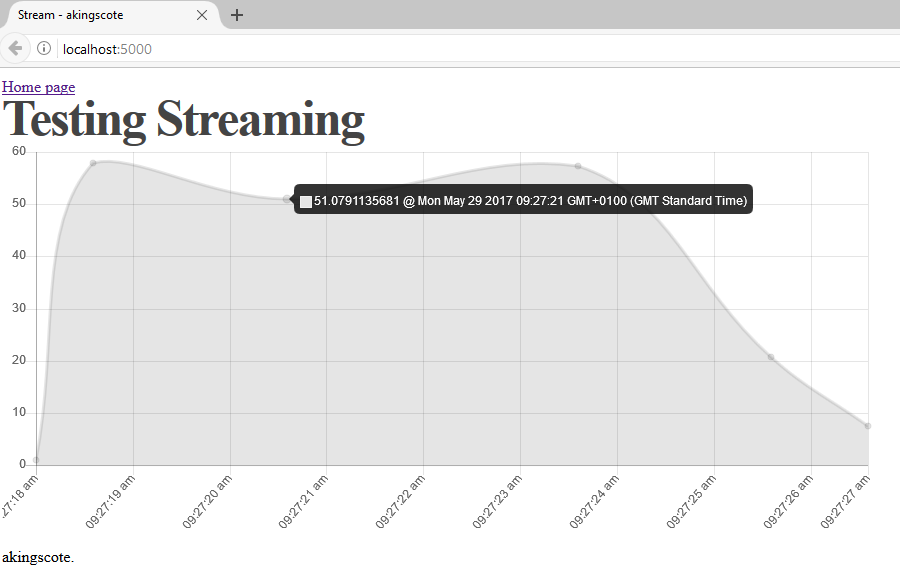
Firstly i set the animation duration to be 500 milliseconds which is nice and quick and dosent make the transition between points too ugly. I then set the xAxis to be a datetime format and set it to show me milliseconds and also AM or PM. I have set the max tickets limit to 10 in order to allign with how many points will be on the chart at any time. I have added a callback function to modify what the tooltip looks like when the chart is rendered. I have made it so that the value and timestamp are on the same line. When updating the tooltip callback, i noticed that if you only modify the xLabel, you still have to explicitly return the yLabel otherwise it disappears completely which is kind of frustrating.
Now we need to pull it all together and render the chart. I create a ChartJS chart object, pass in my Canvas (CTX), declare it as type line and pass in my data and option variables into the data and option parameters.
1
2
3
4
5
var myLineChart = Chart.Line(ctx, {
type: 'line',
data: data,
options:option,
});
That will now render a ChartJS onto the Homepage through Flask. Great. But that will just show that one point, we want a livestream of the timeseries data that we are inserting through the feed_data script. The way i have managed to get that working is to create a repeated function that builds up a HTTP GET request (im doing it through JQUERY AJAX) to a Flask route which queries the database. The result query is returned via JSON and the result is processed.
1
2
3
4
5
setInterval(function(){
$.ajax({
async: false,
url : "get_data",
dataType: "json",
Now comes the magic… Upon a successful data return, I then process the X axis value and convert it to epoch milliseconds. Then what I do is i get the size of the data element of the chart object by using
myLineChart.data.datasets[0].data.length
I then take one away from that value to get the last element position. So say I have an array called akingscote and its size of 10. Its data will be stored at akingscote[0], akingscote[1], … akingscote[9]. I then get the value at the last position (in this example it would be akingscote[9]). I then check to make sure that the data is not the same, if it is then i dont want it plotted. This stops the chart repeatedly adding in the same bit of data every loop if the database hasnt been updated.
1
2
3
4
5
6
7
8
9
10
11
12
13
success : function (data) {

var dateParts = data.timestamp.split(".")
date_test = new Date(dateParts[0].replace(/-/g,"/"));
var millisecs = date_test.getTime();

var chart_data_size = myLineChart.data.datasets[0].data.length;
var latest_element = myLineChart.data.datasets[0].data[chart_data_size-1];
var new_data = { x: millisecs, y: data.value };

if (JSON.stringify(latest_element) !== JSON.stringify(new_data)){
myLineChart.data.datasets[0].data.push(new_data);
}
So the data in Chart JS is in an array. If i kept adding data to it eventually the array would get huge. So what i have done is i say if the array size is larger than 10, then remove the very first element from the array. This way the array will never be bigger than 10. So every time a new piece of data is fetched, I am adding from one end and deleting from the other. I then call the chart objects update function and it refreshes the chart.
1
2
3
4
5
6
7
8
9
10
11
12
13
if (myLineChart.data.datasets[0].data.length >= 10){
    myLineChart.data.datasets[0].data.splice(0, 1);
                                                    };
myLineChart.update();

}
});

}, 2000);

}

</script>
Now this is by no means a full solution, its a quick mock up to get something working.