Animated SVG in Web
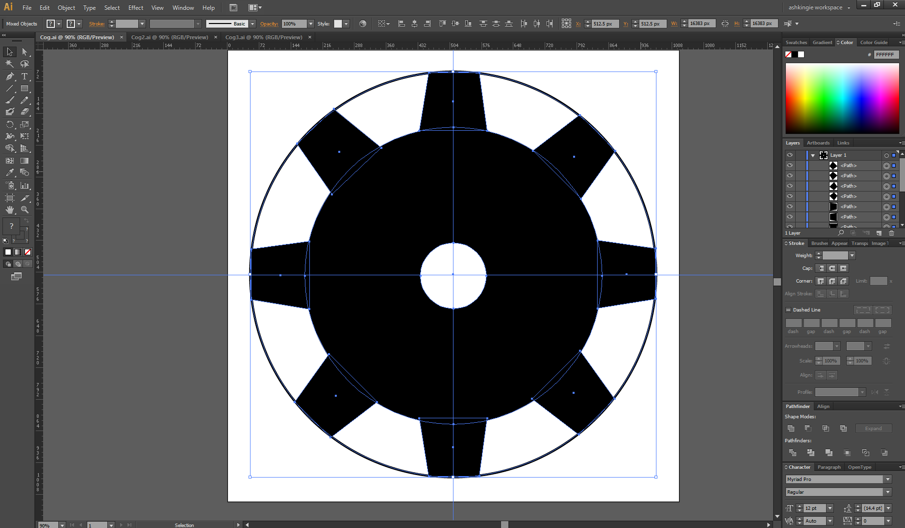
Animated_CogsSo I am starting to get my head around Adobe Illustrator to create SVG images which is a really useful skill for web design. I followed a number of Youtube tutorials and felt confident enough to create some basic designs from scratch. Firstly, I created a couple of cog type components within illustrator and did the Photoshop equivalent of flattening the images to make the vectors a single shape, rather than a bunch of sub shapes.
Highlight all sub components, go to Object -> Expand, ensure Fill and Stroke and enabled and click Ok. Then click on the Pathfinder windows and click Unite 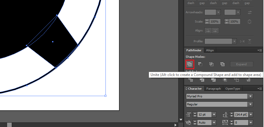
Then click the dropdown within Pathfinder and click Make Compound Shape 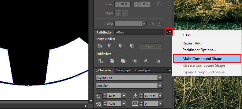
Then back at the Pathfinder section click Expand 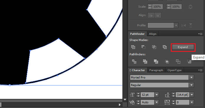
Now the shape is a single compound shape rather than made up of a bunch of sub components. You can now export this and an SVG image and play around with the fill to test its suitability for web! Note - be sure to expand the layer and delete any garbage layers that arent needed. This will simplify your SVG.
I did this for a couple of shape and then copied them all over into a single page. I then drew some thick lines connecting each cog and outlined each path by going to Object->Path->Outline Stroke.
This basically turns the stroke into a rectangle, which makes it easier to trim the edges to make it look like a belt turning the cogs. 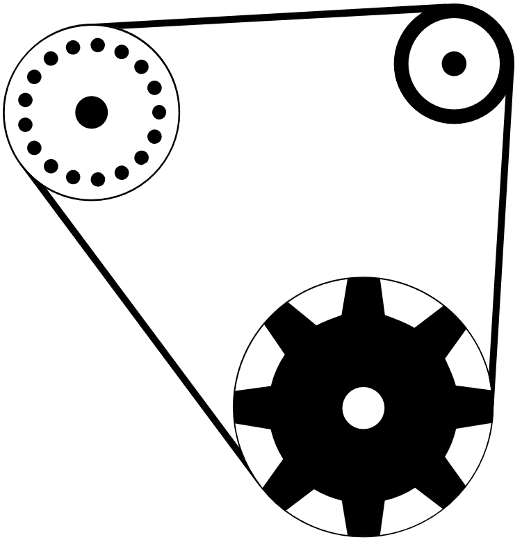
^ this is the finished product, which i am pretty happy with for my first Illustrator only design.
Next, i wanted to see how this would look on the web so i checked each layer for any garbage and deleted, then i renamed each layer, exported to SVG and played around with the fill of each path. 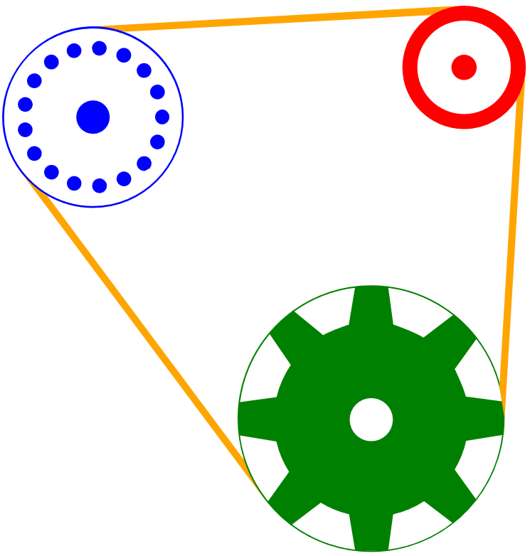
Now, i wanted to see if i could animate the cogs to turn. I found this really really cool library called Greensock which simplifes web animation so much. There are tonnes of different methods to achieve the effect i want, but i think the simplest is to just rotate the cogs on their centre.
1
2
TweenMax.to(bottom_cog, 15, { css: { rotation:-360, transformOrigin: '50% 50%' }, ease:Linear.easeNone, repeat: -1, paused: false });
TweenMax.to(left_cog, 15, { css: { rotation:360, transformOrigin: '50% 50%' }, ease:Linear.easeNone, repeat: -1, paused: false });
The aboves code rotates the two cogs with the ids “cog_bottom” and “cog_left”. They rotate clockwise (change rotation to -360 for counter-clockwise) and rotate from the center of the shape (transformOrigin ‘50% 50%’). The repeat and paused items ensure that the loop is continuous. You can speed up the rotation by decreasing the 15 value.
Open this file in your browser to see the final effect.
You can download the individual cog files, connected cog files and animated HTML file here.